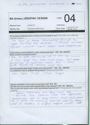
We were given the opportunity to have a final crit then a week to improve. The issues raised for my typeface for Sophie were constructive, provided with actions I could fulfil.
The initial reaction from Sophie was that it presented her perfectly, she has commented saying that:
'really loved the typeface, and think it is the most complimentary side that my personality could take! i really like the curves in the typography, that are subtle, yet still stylised. think this represents my love of all things quaint, with a touch of romanticism- a typeface i would be proud to call my own!'
The crit style was a presentation with partner of the final A1 sheet and an open dialogue with others in group with Amber and Jo both present.
As I said before it was a very useful crit style.
Suggestions:
-Try upper case, experiment with a few letterforms and glyphs.
-Re-work some characters, especially the '&' glyph as it isn't balanced.
Which leads onto
-Come up with some rules, look at similar letterforms e.g. qp eo db lj etc.
-Look at using different colours, relevant - icing colours/ pastels especially for name badge.


