
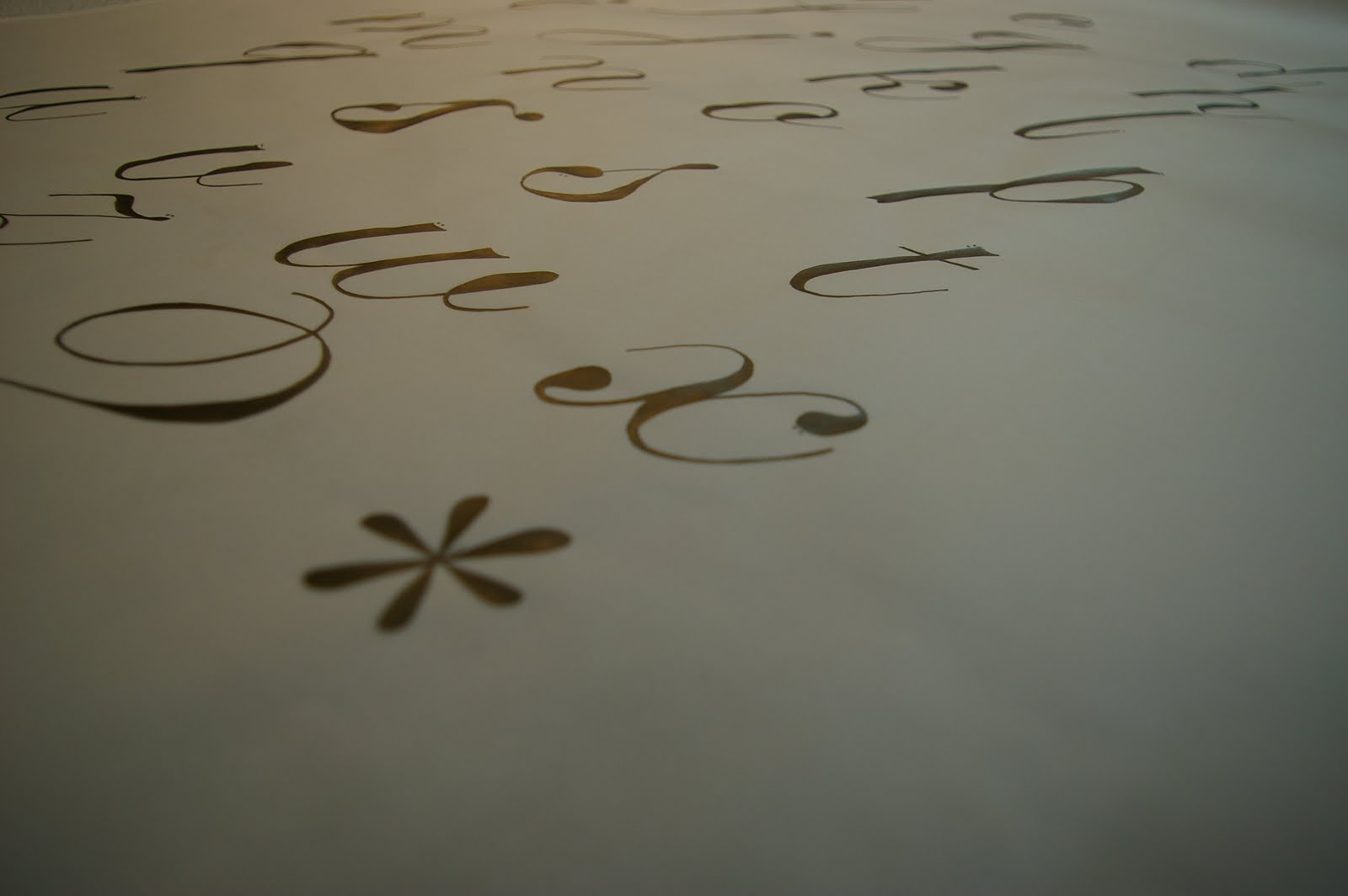
The word given to me as part of our brief 'divide' is being communicated through my typeface.
How well does this answer the brief?
I believe the brief is answered effectively through my letterforms. They experiment with type on an original basis.
How well has the idea been visually explored?
I think the experimentation in this brief was possibly the most important factor, deciding on what worked and what didn't was an important focus.
What are the strengths of the resolution?
As a sequence I believe the letterforms work, but the main strength being individually. They are strong images that present well with good contrast of colour.
How could it be improved?
Some of the photographs could have been improved. They could have been lit more dramatically presenting the shadows with more effect.
General comments...
I have enjoyed this brief and increasing my knowledge of type. I didn't use any software as my knowledge of it is not extensive and I believe it should be a tool to improve things but not create an entire answer to a brief.
No comments:
Post a Comment